CORPORATE IDENTITY
ABOUT THE LOGO OF DESIGN
LOGO OF NESTLE KitKat
THE LATEST LOGO FOR NESTLE KitKat

- The latest design of the Nestle KitKat logo
- I like eat KitKat because the flavor of KitKat is chocolate
- Design of the KitKat is very simple and nice look like
THE LOGO OF PEPSI
The logo of PEPSI design from 1898 until Today
- From year by year, design of PEPSI change and the logo become simple logo but look nice.
- From that picture can see the first logo look like and today just look simple of design.
LOGO OF FRESH PEPSI

THE LATEST PEPSI LOGO
LOGO OF PEPSI LOOK LIKE
- Everyone like drinking this water
- The color of the logo look beautiful and just use three color
THE LOGO OF APPLE


The first logo in 1976 until current logo today

- The original Apple logo featuring Isaac Newton under the fabled apple tree.
- The rainbow Apple logo, used from late 1976 to early 1998.
- The monochrome Apple logo, used from 1998 to present.
- The logo seen on the start up of several of Apple's computer system and iPods.
THE FIRST DESIGN FOR ANIMATION OF UPIN&IPIN
THE LOGO OF ANIMATION GENG ADVENTURE BEGINS

THE IMAGES OF UPIN&IPIN ANIMATION

UPIN&IPIN
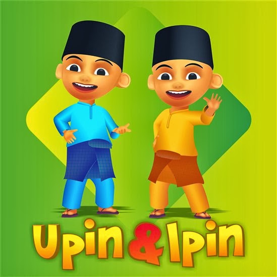

- Many children and many people like this animation
- Animation stories Upin&Ipin was deeply loved by everyone
- This animation is very interesting
- When to wacth this animation Upin&Ipin the story is not boring
THE LOGO OF NBC
- The meaning of NBC is National Broadcasting Company
- This is symbolized the switch from black and white to color TV shows
- The National Broadcasting Company (NBC) is an American commercial broadcast television and radio network. It is headquartered in the GE Building in New York City's Rockefeller Center, with additional major offices near Los Angeles and in Chicago. NBC is sometimes referred to as the "Peacock Network", due to its stylized peacock logo, which was originally created for its color broadcasts.
Two distinctive features of the film's showings on NBC were :
- The film was shown for the first time without a host to introduce it as had always been previously done
- The film was slightly cut to make room for more commercials. Despite the cuts, however, it continued to score excellent television ratings in those pre-VCR days, as audiences were generally unable to see the film any other way at that time.
Task 1 : Sketches the logo
This sketches I refer to starfruit images.
- for my sketches logo
Example : Task 1 ( 1 )

Example : Task 1 ( 2 )

Task 2 : Create the logo
For task 2 must create the logo using the geometric.
- do the images of logo must use the geometric for the logo company.
Example : Reference
To this images before create the logo use the geometric.

Example : Task 2
This my own work use the geometric.
- from this geometric I can create the logo for myself.
- from this also I study how to create the logo using the geometric.
- how to get the images from
The Logo for the reference :
Example : This logo for competitors


Example :
- This tree images for brand, identity and logo.
* Brand
- Perceived emotional corporate image as a whole.
* Identity
- Visual aspects that form part of the overall brand.
* Logo
- Identifies a business in its simplest form via the use of a mark or icon.
Example : Reference
- Because want do the best logo for my logo design and my own company.
- I like this logo

- For this task, I must do the sketches first for my own company.
- From the sketches, I must choose three logo for my company.
- After that, do the sketches to the Adobe Illustration ( AI ) and than choose one the best design for the company.
- This my sketches picture.
Example : Reference
- For the sketches from the internet.


Example : For the sketches.
- Before do the logo company, I must sketches many logo.
- This my sketching.
- From this i have three choice before do my company logo.


My Design
- From this I choose the second logo design for my company.
- Name for my company logo is Lynn Design.
Example : 1
- This design for my company.


- This my second example for my company logo design.


- The last example for my company design of logo.


.gif)


This logo for my company and I choose this for the color of the logo.
.gif)
This another work I do. From this work I can use the another logo for my letterhead, brochures, and name card of my logo company or i just use the one logo.

This another idea for my company.
Example : Use the typeface for making the color into logo.

After that :
- From the logo company must know the CMYK color of a logo company.
- Identify the colors used in the logo company.
- Then convert to the Grayscale to black and white color.
- Convert to CMYK
- Convert to Grayscale

.gif)
- Company Logo
- The letterhead
- Envelope
- Name Card
The Company Logo

The Letterhead

The Envelope and Name Card

No comments:
Post a Comment